
A Starry Night of Emoji
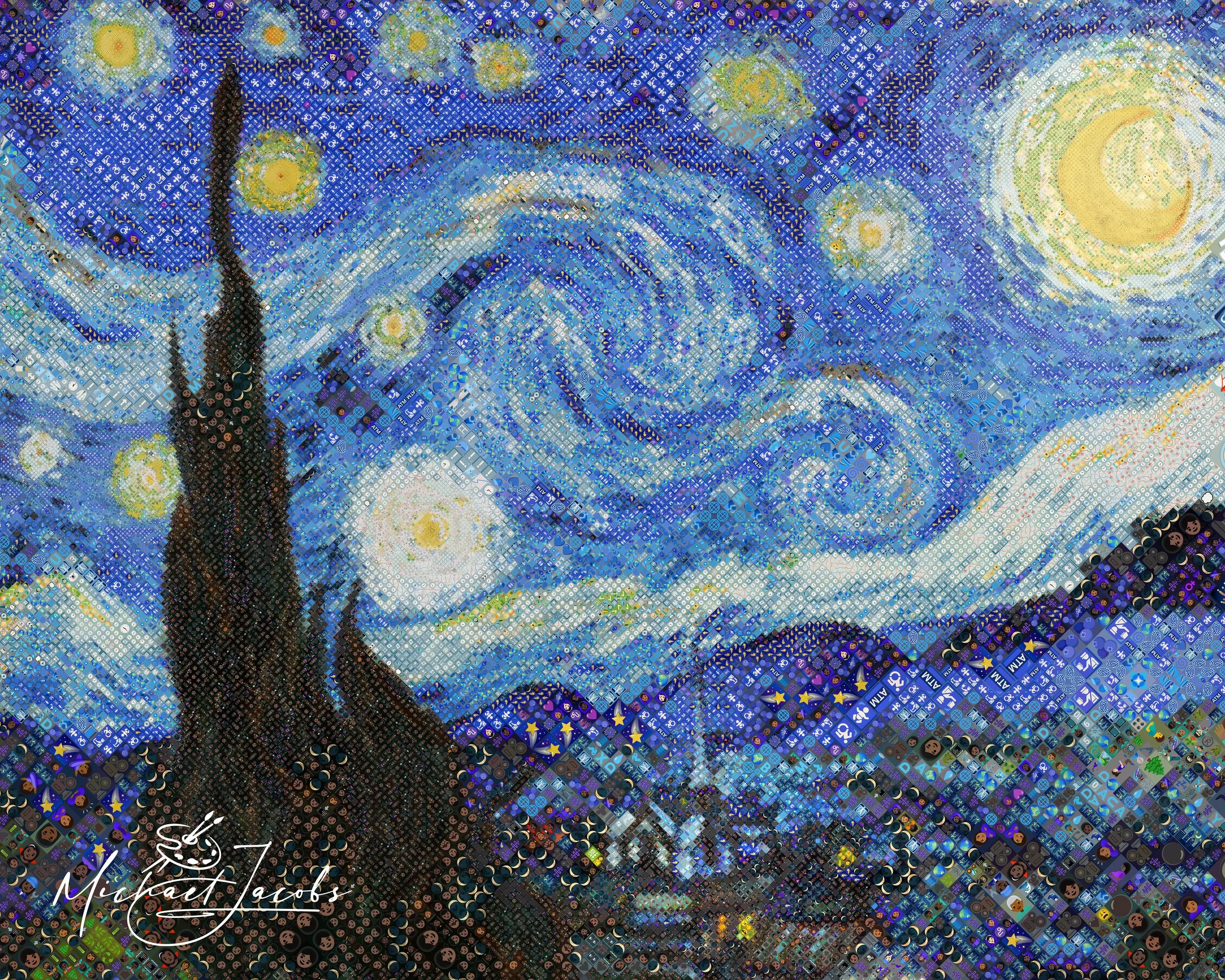
Van Gogh didn't paint the sky. He encoded it. Every swirl arm in The Starry Night is a vocabulary of marks — short, directional, rhythmic strokes laid against each other to build motion out of stillness. The painting is structured like music. That structure is the whole point.
Recreating it in Diamojism meant the system had to read that structure and respond to it. That turned out to be more complicated than anything I'd built before.
Why Starry Night
Many previous Diamojis were built around human faces. Faces give the system a clear hierarchy — eyes are important, lips are important, cheekbones less so. The system reads that hierarchy and places its finest tiles where they matter most.
The Starry Night has no faces. The finest tiles had to go to the swirl arms, the stars, the crescent moon, the cypress tree tip. I had to define all of that by hand. That meant 26 hand-placed regions covering every significant element in the composition — each one telling the system where to focus and how fine to go.
The painting also has a very specific palette. Van Gogh's sky is painted in deep Prussian and cobalt blues — cool, dark, slightly desaturated. The emoji library has many blue emoji. None of them are that blue.
That mismatch was the central challenge of the project.
The Palette Problem - A new tool is born
When I ran the first serious renders, the sky looked wrong. The emoji the system was selecting were close to the right blue — but they skewed slightly warm, slightly violet, slightly slate. The sky read muddy instead of deep. It looked like a painting seen through tinted glass.
I could filter out the most obviously wrong emoji. I could push the selection system toward cooler candidates. None of it was enough. The core problem was structural: if the emoji library doesn't contain the color you need, no amount of selection tuning can find it.
I built a new palette correction tool to solve it. After a completed render, the tool looks at every emoji that appeared in the image and asks: how far off was its color, on average, from the tile it was placed in? It measures that gap across hundreds of placements per emoji and fits a correction for each one. The corrected values get stored in a file alongside the project. On the next render, those corrections are applied to those emojis and only those emojis.
278 emoji were corrected. The sky shifted. The Prussian blue became legible.
Getting the Swirls and Moon Right - Isolating tone adjustments
Fixing the color was necessary. It wasn't sufficient. The swirl arms also needed to feel like swirl arms — directional, energetic, distinct from the quieter sky between them.
The system scores emoji partly on their edge character — the direction of contrast within the tile. I pushed that score higher than on any previous project and allowed emoji to appear in rotated orientations. The selection steered toward emoji whose internal structure aligned with the brushstroke direction in each tile. The swirl arms started to feel like they were moving.
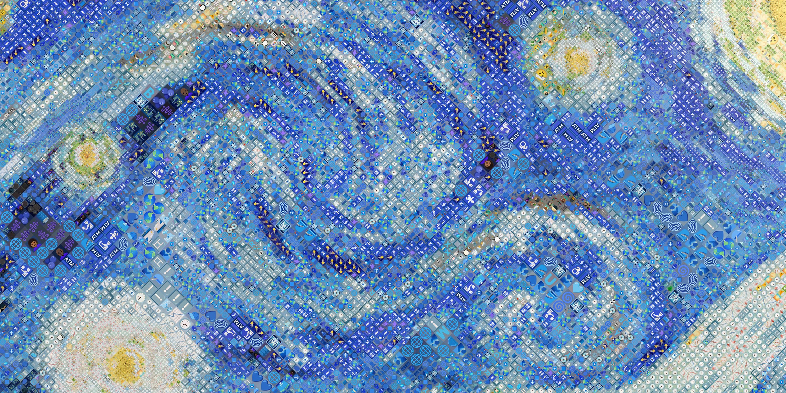
A new pipeline feature enabled me to selectively add local contrast boost to the swirls
Contrast was the other piece. The swirl arms need to be crisper than the surrounding sky. Raising contrast globally would have blown out the stars and darkened the village. I needed a new feature: individual tone adjustments per region. Each region of the composition — swirl paths, village, stars, moon — could now be tuned independently, without touching anything outside it.
The moon showed what that made possible. Van Gogh's crescent is luminous cream against deep blue. The system kept selecting emoji from the smileys-and-emotion group in that area — round, pale, often yellow, a strong color match for a glowing moon. They also looked like faces. I kept them and applied a strong desaturation to the moon region, pulling the warmth out of the yellow tones. The smiley faces became cream. The moon became a moon.
Drawing the Sky Boundary with Photoshop
There was one more geometry problem. The sky and the village meet along a curved, organic horizon. The cypress tree cuts through that boundary. A rectangle can't describe that edge. A path corridor is too narrow to cover the whole sky.
I needed a way to paint a region freehand — to draw the sky's exact boundary in an image editor and hand that shape to the system.
I built a third type of region geometry. A grayscale image, painted by hand in Photoshop, acts as a region map. The system reads the painted boundary and treats it like any other region — keeping the entire sky at a consistently fine tile size.
The village and the cypress tree fell outside the mask. They weren't affected.
A New Way to Look at Renders
Building all of this required a new tool I hadn't anticipated needing: a way to inspect individual tiles in a completed render.
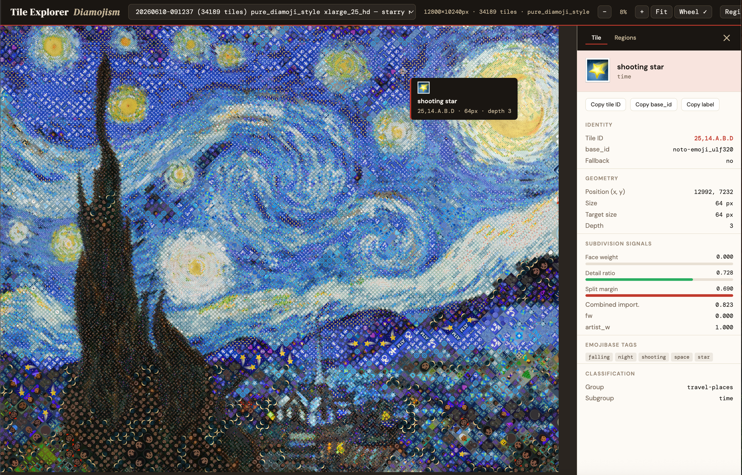
Every Diamoji is composed of thousands of individual tiles, each one an emoji chosen for that specific location. When something looks wrong in a render, I need to know exactly which emoji landed where, why the system chose it, and what the surrounding tiles look like. Doing that by hand — zooming into a 393-megapixel image and cross-referencing a spreadsheet — isn't practical.
I built the Tile Explorer. It's a local browser tool that loads a completed render and lets me hover over any tile to see exactly what emoji is there, what size the tile is, and how the system scored it. I can overlay the artist regions I defined and zoom into any of them directly. I can inspect the sky and see which emoji are carrying which parts of the blue gradient. I can find the smiley faces in the moon before I decide how to handle them.