
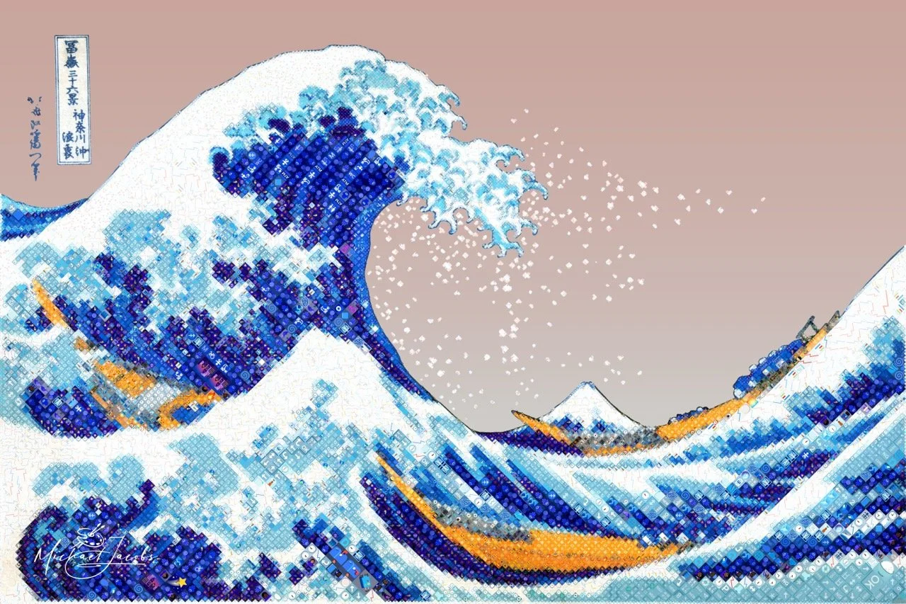
The Great Wave, Reimagined in Emoji
Most Diamojis are portraits. There's a good reason for that. The human face gives the system a natural hierarchy — the eyes demand the finest detail, the contours of the face give the tile grid somewhere to go, and the result rewards the viewer at both distances. Step back, and it's a face. Step forward, and the emoji surface reveals itself.
The Great Wave off Kanagawa has none of that. No face, no eyes, no portrait logic. Just a wave — enormous, curving, precise — and a very large expanse of sky.
That's exactly why I chose it.
The Great Wave became a Diamoji over nine days and 53 iterations, producing a finished work of 18,159 tiles from 606 unique emoji. Getting there required building three new capabilities: a way to steer the system's emoji choices toward the subject's thematic world, a way to draw influence regions that follow the actual curves of the wave rather than boxing around them, and a way to let the source image show through in the sky — where rendering emoji would have produced flat, repetitive texture instead of atmosphere. A new comparison tool made the iterative process manageable at print resolution.
A new set of problems
The wave surfaced three limitations in the Diamojism system that I hadn't needed to solve before.
The first was the sky. When the system encounters a large region of near-uniform tone, it places tiles that are visually similar to each other across the whole area. The source image is similar across that region, and the system follows it faithfully. But the result, in a flat sky, is a repeating wallpaper texture that draws attention to itself when it should be receding. More detail wouldn't fix it. The sky needed a different answer entirely.
The second was contour. I already had a way to tell the system where to concentrate its finest work — by defining rectangular regions of influence over the important areas of the image. That works well for a face. It doesn't work for a wave. The foam claws of The Great Wave follow long, sweeping curves that no rectangle can trace without claiming half the surrounding sky in the process.
The third was meaning. The system selects emoji by asking a single question: which symbol best matches this tile visually? It has no idea what any emoji depicts. For a wave made of water, that felt like a missed opportunity.
Steering the tile vocabulary
The first new capability lets me define a thematic vocabulary for each piece — a curated set of emoji whose meaning connects to the subject. For The Great Wave, that meant ocean, weather, marine life, boats, and the visual world of Japanese ukiyo-e prints.
The vocabulary doesn't work as a hard filter. An emoji outside the theme isn't disqualified — it's made slightly less competitive. An on-theme candidate gets a modest boost. If two candidates are otherwise equal, the one that belongs in this world wins. But if an off-theme emoji is genuinely the better visual match, it will still be chosen. The aesthetic quality of the piece is never sacrificed to thematic tidiness.
The result is something the viewer discovers rather than reads in a caption. At viewing distance, the wave reads as a wave. Zoom in — or step up close at a print — and the individual tiles become legible. The water is built from things that are the ocean. That correspondence between what the tiles look like and what they mean is built into the work. It doesn't announce itself. In practice, only about 26% of the tiles in The Great Wave are from the selected vocabulary.
Getting the vocabulary right took real judgment. Too narrow a set of emoji means the system struggles to cover the full tonal range of the image — there simply aren't enough on-theme options across the full spectrum of light and shadow, and the piece suffers visually. The right vocabulary is broad enough to give the system room to work, and specific enough to feel intentional.
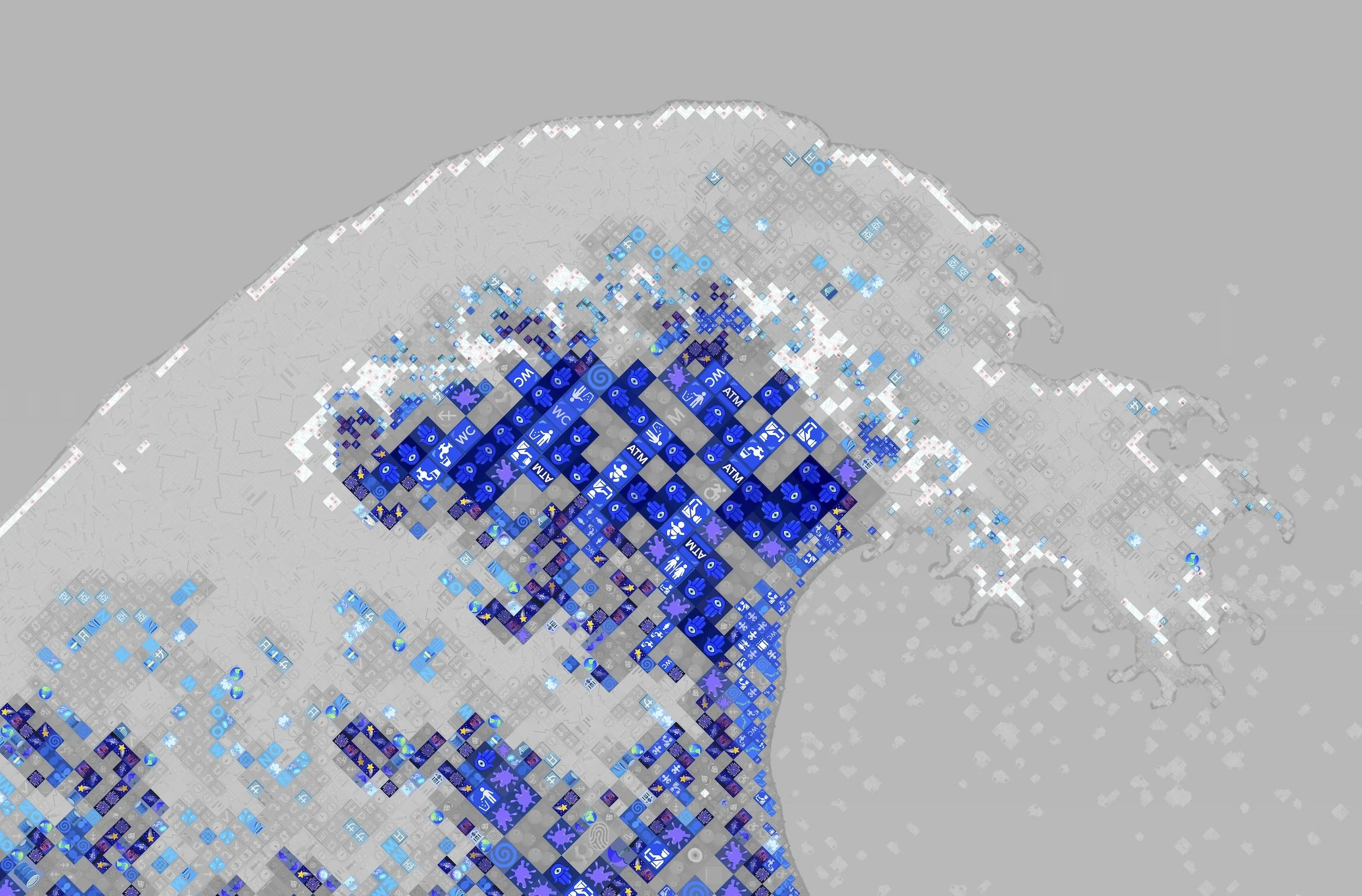
The vocabulary at work
This Diamoji begins with a vocabulary. Before the system placed a single emoji in The Great Wave, I defined a set of theme keywords drawn from the painting's world — words like travel, ocean, foam, mist, fog, indigo, and Japanese woodblock. Emoji whose identity connects to those ideas were considered on-theme and given an advantage in the selection process.
This visualization makes that distinction visible. Tiles in full color were filled by an on-theme emoji — a fog bank, a shooting star, a crescent moon — something that belongs, however loosely, to Hokusai's sea. The muted gray tiles were chosen just as carefully for their visual accuracy, but their subject matter has no connection to the ocean.
Up close in the interior of the wave, the deepest blues are overwhelmingly on-theme. The system reached for the sea and found it there.
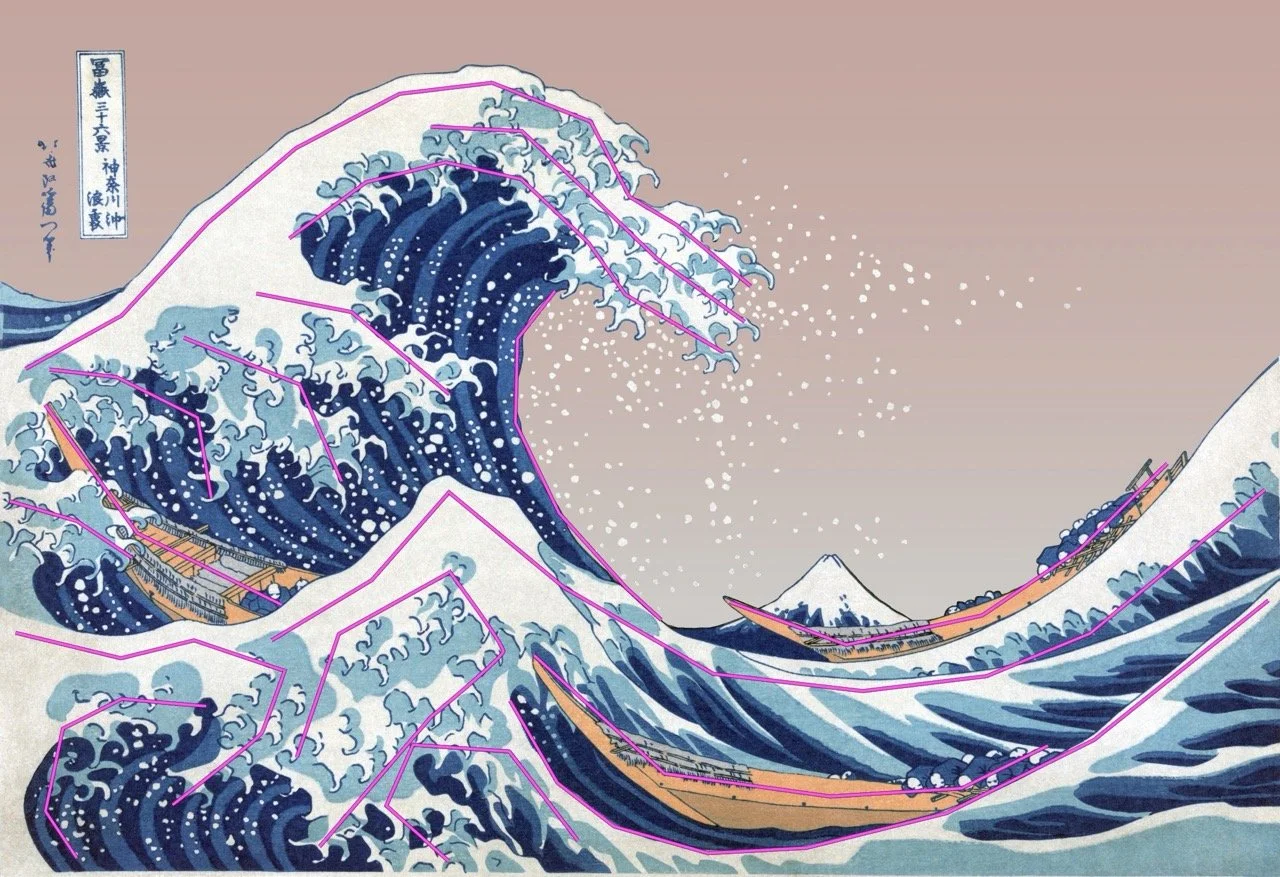
Drawing where the detail goes
The second new capability is path-based influence regions. Instead of drawing rectangles over the source image to direct the system's attention, I can now trace lines — freehand line segments directly over the image contours that matter.
The workflow uses two tools I built for this. The first runs inside Photoshop: after I draw and name each line in Photoshop's path tools (see the magenta lines), the script reads those paths and exports their coordinates. The second reads that file and writes the corresponding influence regions into the project configuration. Each named line becomes a graduated zone of elevated detail influence that follows the actual contour of the wave rather than boxing around it.
Iterating is natural. Adjust the lines in Photoshop, re-export, re-run — the utility updates the geometry while leaving all the behavioral tuning I've already dialed in untouched.
Letting the original show through
The sky problem had a simple answer, once I saw it clearly: don't render the sky at all.
The third new capability is the inclusion mask. I draw a mask in Photoshop that precisely defines which parts of the composition should become emoji and which should remain as source image. The mask for The Great Wave follows the wave silhouette. The water, the foam, the boats, and Mount Fuji are mosaic. The sky is source image — the adjusted public domain scan, incorporated directly into the composition.
There is no original Great Wave. Hokusai's prints were produced in large editions over many years, and no two surviving impressions are identical. Every copy has aged and faded differently. The sky in any given scan reflects the particular history of that particular impression, not any authoritative version of what Hokusai intended. Before rendering, I simplified and adjusted the sky region — removing the discoloration of one specific nineteenth-century impression to arrive at a considered reading of what the sky could have been in the originals. The rose-tinted sky pays quiet homage to the warm atmospheric tones that appear throughout the ukiyo-e tradition — the blush and amber skies found across Hokusai's own Thirty-six Views of Mount Fuji series and in the celebrated twilight landscapes of Hiroshige — placing The Great Wave in conversation with the broader world of Japanese woodblock printing rather than treating it as a single iconic image in isolation.
The boundary between the emoji mosaic and the sky is hard, not soft. The wave in Hokusai's design has a graphic, defined edge — it's a woodblock print, and its contours are drawn. A soft dissolve would look like a technical limitation. The hard edge is the right edge.
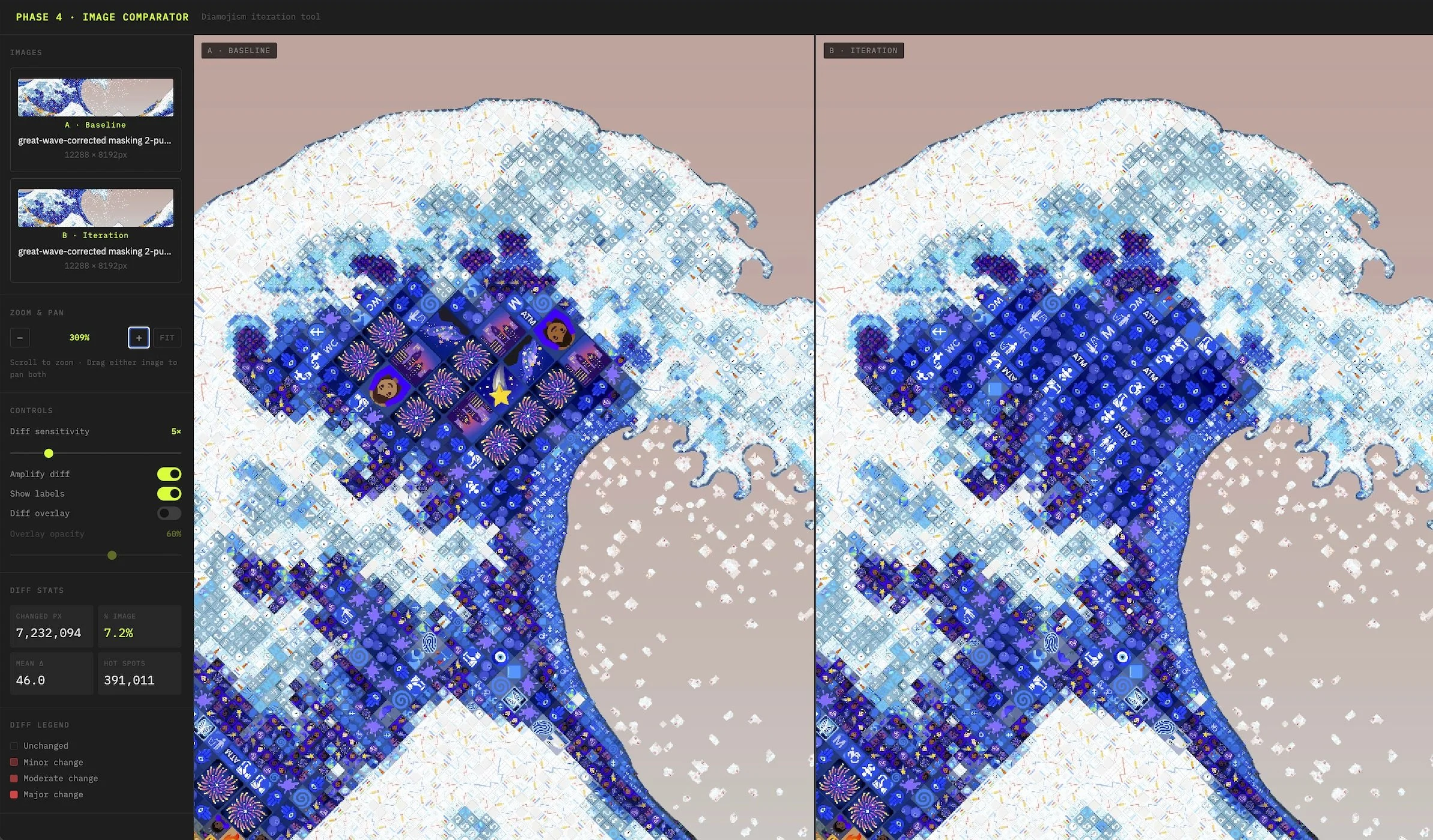
Seeing what changed
Fifty-three iterations over nine days, with renders averaging 7.5 minutes each. That number reflects what iterative refinement actually costs at print resolution when the subject is complex and the decisions are numerous.
After each iteration I need to assess what changed. Where did the new settings improve things? Where did they create new problems? At portrait scale, that comparison is manageable — the face provides clear reference points. For The Great Wave, with no face and no natural focal hierarchy, the comparison is harder. Subtle changes in a large, complex composition are easy to miss when flipping between two image files.
I built a browser-based comparison tool specifically for this workflow. It shows a baseline render and an iteration side by side, with two capabilities that make it substantially more useful than just opening two files. The first is synchronized pan and zoom: both panels move together, so the same region is always visible in both at the same time. The second is a difference overlay — a heat map of pixel-level changes that I can dial up to see where the differences are concentrated, then dial back to assess whether they're improvements.
The tool sounds modest. In practice it changed how I work. It makes change visible that would otherwise go unnoticed until it appeared in a print — which is too late.
What it came to
The finished piece contains 18,159 tiles drawn from a vocabulary of 606 unique emoji. At viewing distance, it reads as The Great Wave. Up close, it reads as the ocean — the meaning and the image in correspondence, at every scale.
Each of the three new capabilities developed for this piece is now part of the Diamojism system and available for future work. The path-based regions change how I can direct attention across any organic subject. The inclusion mask changes the relationship between a Diamoji and its source — the source is no longer an input that disappears into the rendering process, but a potential collaborator in the finished composition. The thematic vocabulary adds a dimension of meaning that operates alongside visual fidelity, independently of it.